
PAN AM - Pan American Airways
background
Pan American Airways, commonly referred to as “Pan Am” after 1950—was the principal and largest international air carrier in the United States from 1927 until its collapse on December 4, 1991. They see an opportunity opening up in the airline industry and are ready to make a comeback. They plan to launch a new airline in the next 12-18 months and are looking for a streamlined, thoughtful user experience to match.
THE OBJECTIVE
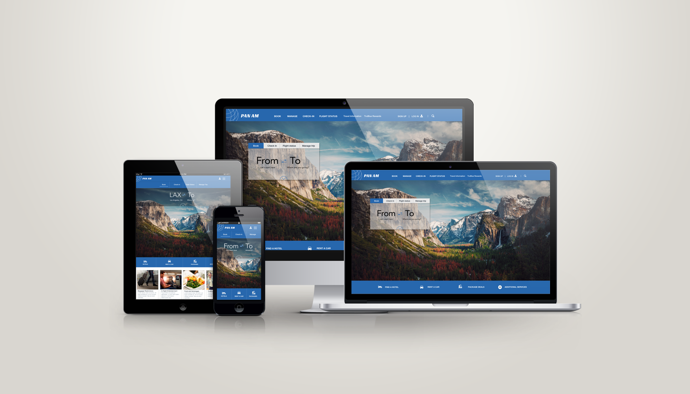
Pan Am wants a next-level user experience for their core digital flow involving the booking and online check-in of flights. The objective is to design a responsive website for desktop, tablet, and mobile that covers the main functionality: search, booking, and online check-in. In addition, I will re-fresh the brand while keeping the essence of the original.
THE APPROACH
The existing mental model for booking airline tickets is significant. I will focus on small changes that can enhance user experience rather than trying to start from scratch. I will research how users book tickets and try to uncover their pain points and unmet needs in the process. I will apply the design thinking model (Empathize, Define, Ideate, Prototype and Test) to the project. Using this approach, I will set research goals and conduct user interviews and secondary research to uncover user needs.
EMPATHIzE - RESEARCH
Methods
I started my secondary research by conducting a competitive analysis of several airlines that could be competitors to Pan Am. I wanted to learn more about the airline industry-standard features and design patterns and to see if there were any opportunities for Pan Am to create a next-level user experience by comparison. I also did an exhaustive literature review about the airline industry in general and customer satisfaction in particular. Finally, I conducted user interviews with 6 participants.
Conducting a competitive analysis allows me to determine industry standard features and design patterns and to discover any opportunities for Pan Am to rise above the competition.
SUMMARY OF FINDINGS
From the initial research I discovered the 3 C’s of airline travel : cost, comfort and control. Users make most of their decisions based on cost first. Users also want to be in control of their experience, knowing exactly what to expect. They also value their comfort. I will see how I can translate these needs into actionable items in the website design.
DEFINE THE PROBLEM
AnalysING research findings
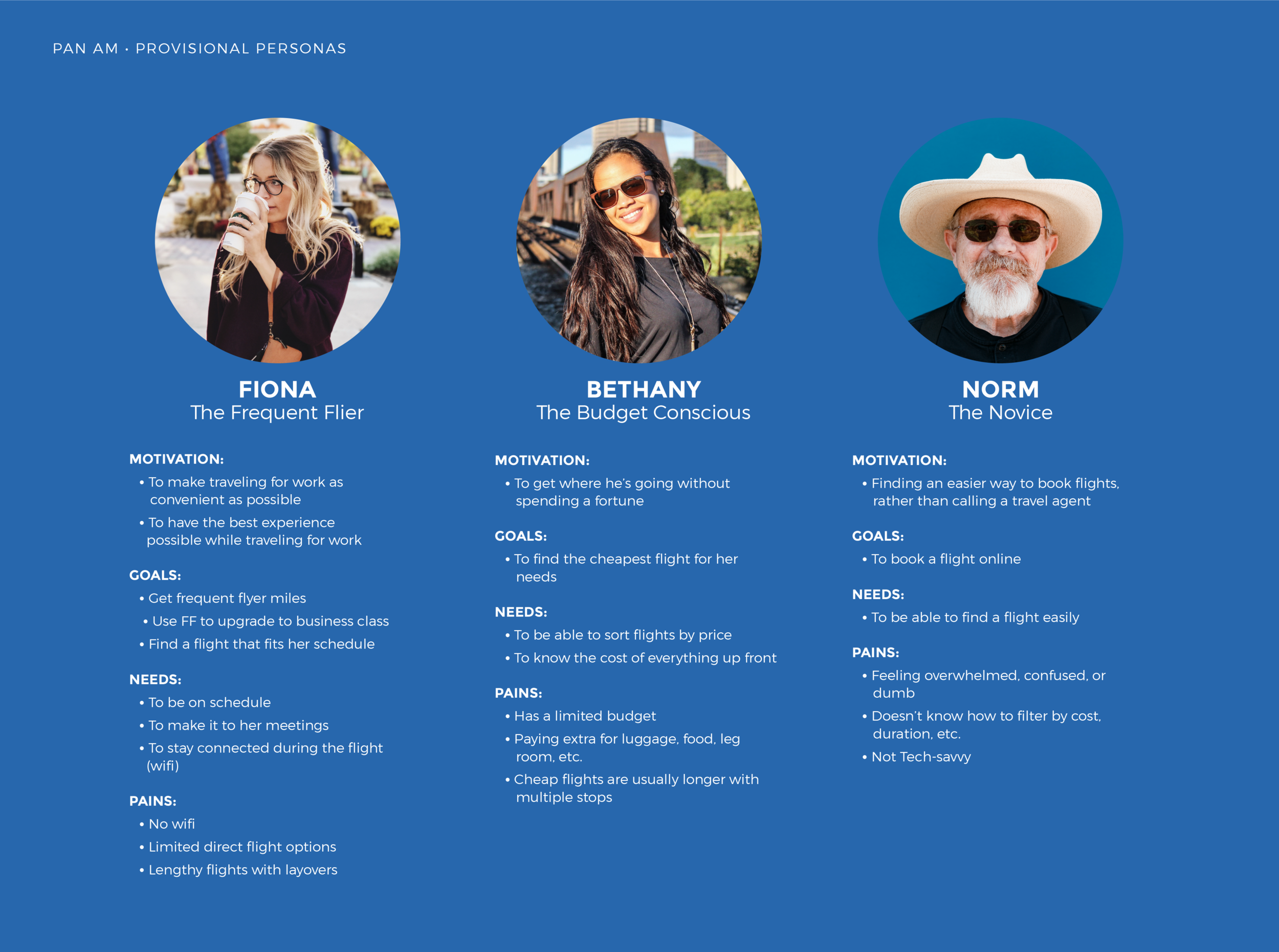
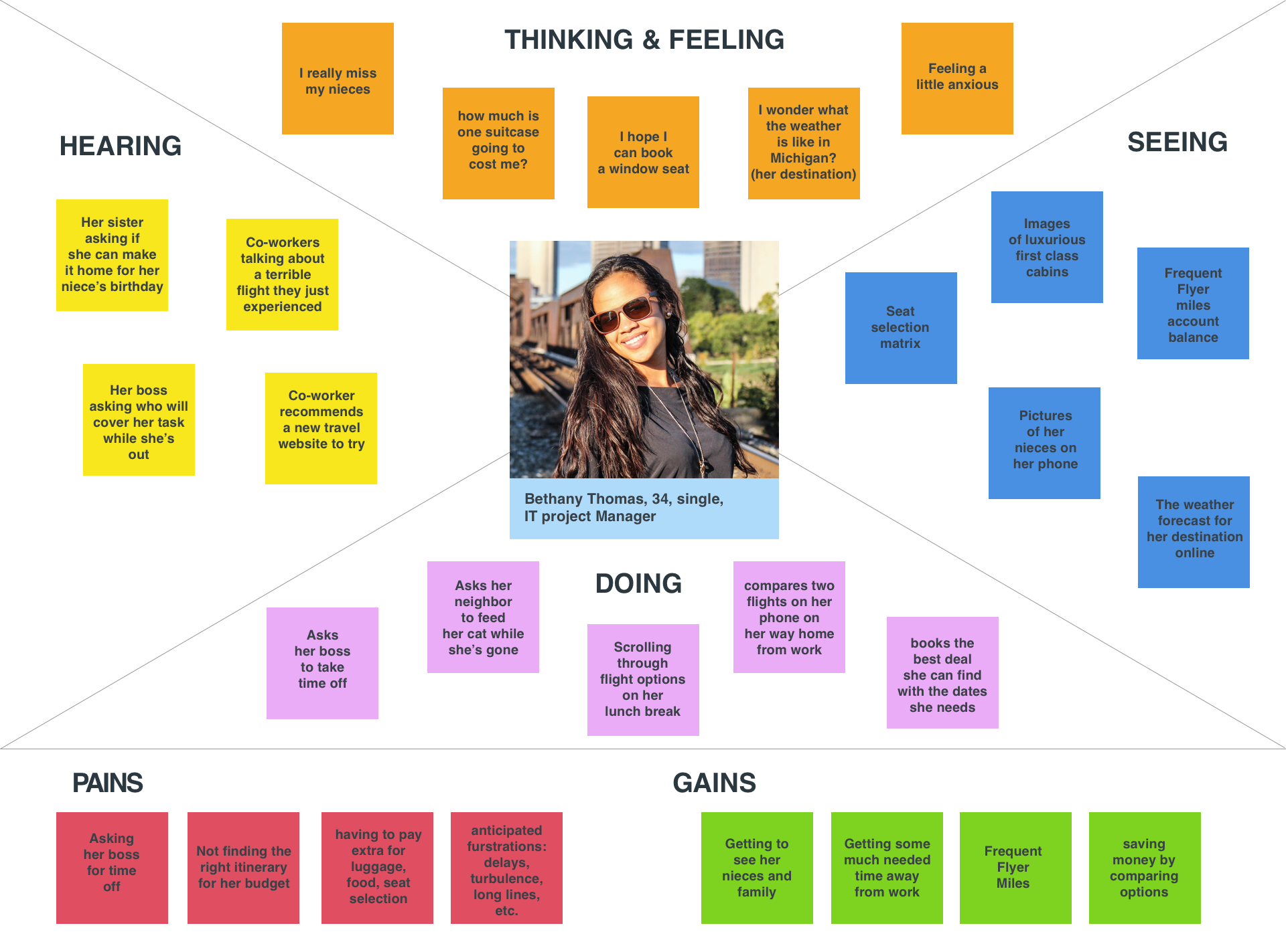
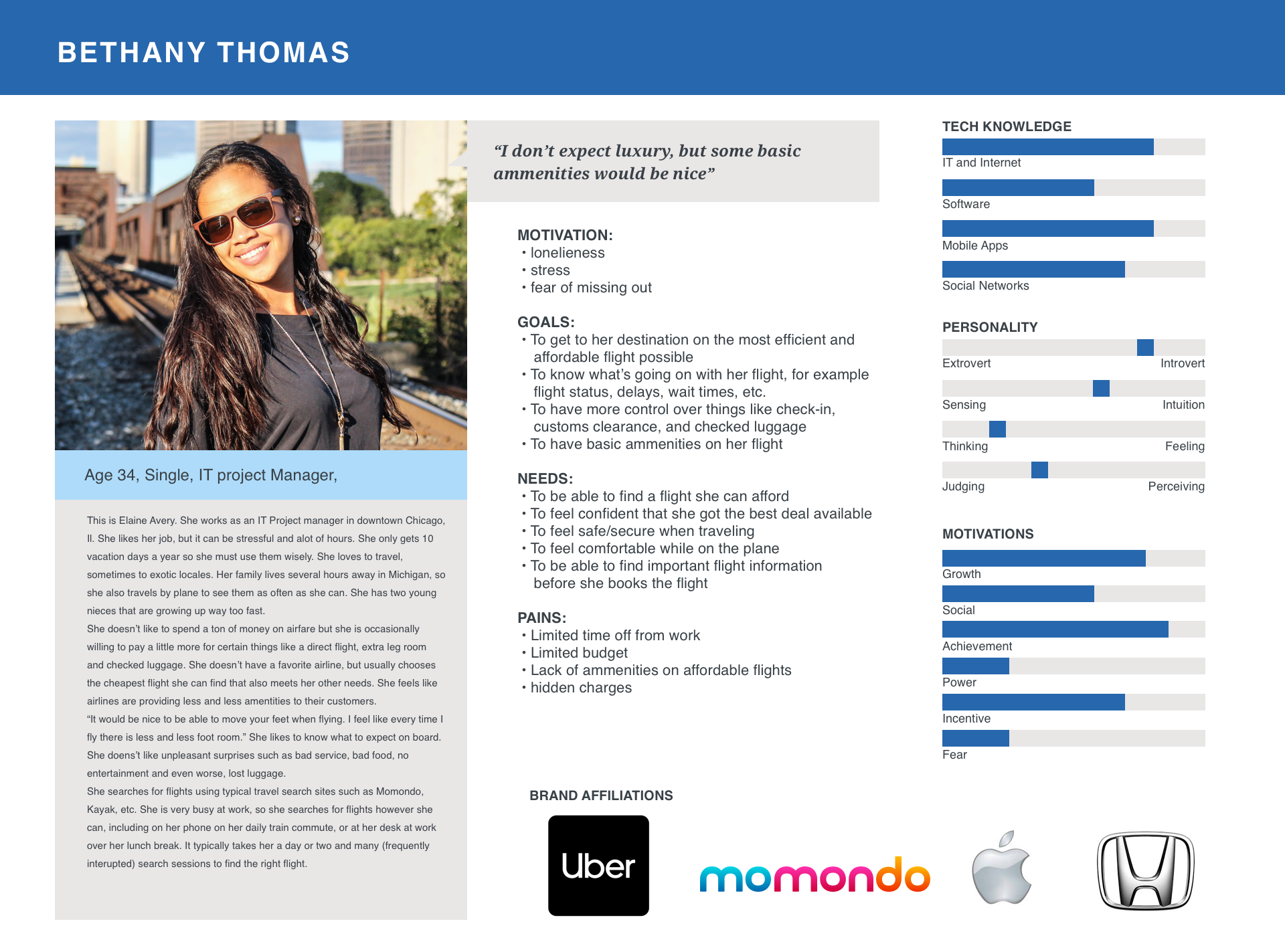
I used several tools to analyse my research findings to help define the problem. From my competitive analysis and secondary research findings I created provisional personas. I used these personas for guidance throughout the project. I made design decisions to address the needs of one or more of these three persona types. I also created an empathy map to better understand the context of the problem and an expanded persona for the budget conscious traveler. I chose to focus on the budget conscious traveler because my interviewees most resembled that archetype. View PDF version here
How might we?
With the users’ motivations, goals, needs and pain points identified, it’s time to translate them into actionable items. I created some “How Might We” questions to illustrate the problems and to spark brainstorming of possible solutions.
For our frequent flier:
How might we help her choose the best flight experience for her needs?
For our budget conscious traveler:
How might we present the flight prices in a way that makes it easy for her to find the cheapest one?
For our novice:
How might we simplify the flight booking process so it doesn’t overwhelm him?
SITE MAP and user flow diagram
Also in the define phase, I started to plan for the structure of the site and how the user will interact with it. Creating a sitemap allows us to examine the information architecture of the site. User task flow diagrams help illustrate exactly how a user will accomplish their task step by step. As mentioned, the existing mental model for booking a flight is significant, so I didn’t deviate from the existing user flow much.
PDF site map | PDF task flow diagram
PAN AM site map.
Booking a ticket task flow.
IDEATE
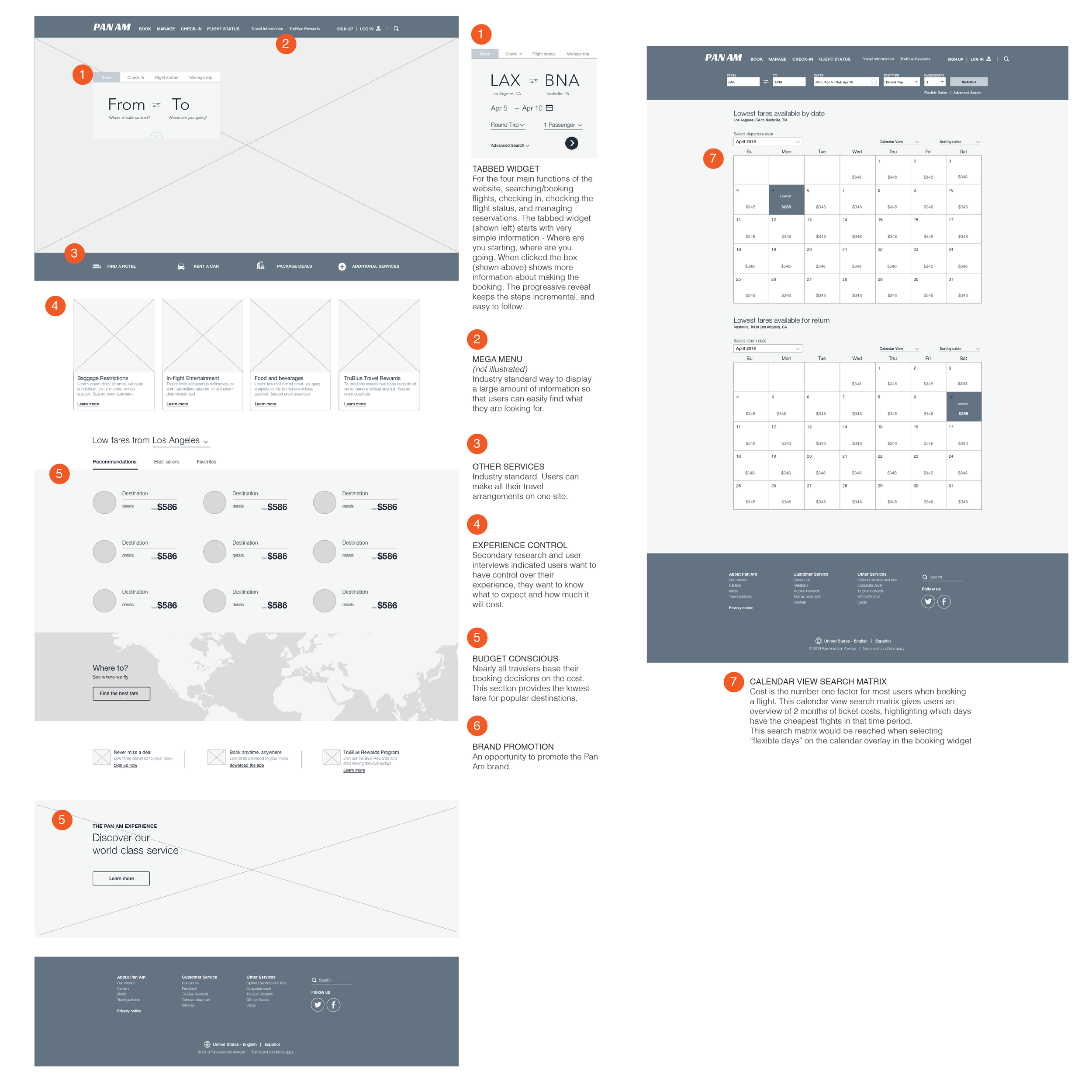
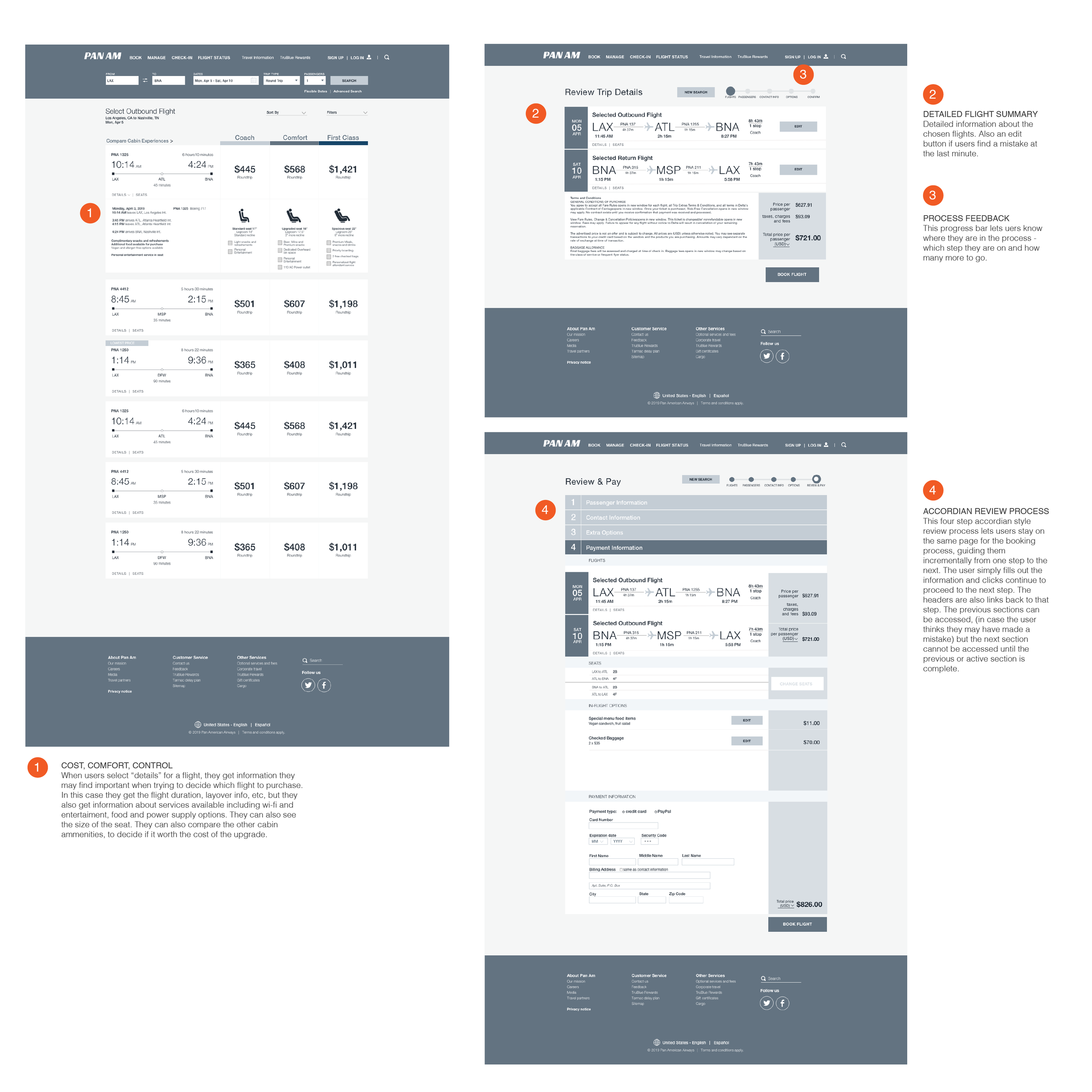
Now it’s time to explore all possible solutions to the design problems. sketching various versions of the landing pages helps to make sure the content is in the right place. I wanted the landing page to be clutter free with a booking area that immediately draws the user to interact with it. After sketching possible layouts, I chose the one I thought accomplished this best and started making some low to mid fidelity wireframes to test. I annotated some of my design decisions and how they relate to the user needs.
view PDF of annotated wireframes
UI DESIGN
The scope for this project included a re-branding effort. The challenge was the keep the original essence of the iconic brand, but to give it a modern update. I chose to keep the Pan Am blue and give the globe a bit more modern feel. The original “windswept” typography was dated. I opted to substitute a more modern font that still had a bit of motion to it.
Prototype
After the potential solution has been identified and sketched and wireframes built, it’s time to build a prototype of the solution that users will be able to test in the final test phase. My prototypes focused on the user flow of booking a ticket. It’s important to note that prototypes are built for specific testing purposes and not a fully functional website. I built a mid-fidelity prototype in InVision for the desktop site. I also built a high-fidelity prototype for the mobile site in Marvel.
To view my mid-fidelity desktop site prototype in InVision, click here.
Click on the high fidelity prototype below to interact with it.
TEST
In the final phase I conducted usability testing with 5 users. The setting was more of a focus group type setting where the users were looking at the site at the same time. 100% of the users were able to complete the flight booking task that was being tested with the prototype. There were no critical errors.
There was valuable feedback gathered from the users regarding layout and design.
NEXT STEPS
After user testing, I have a handful of high priority revisions to make in the next iteration. After that, user testing should be conducted again before packaging the project for hand off.