

ZEIT: A responsive, e-commerce travel website
Background
Zeit is a subsidiary of Richard Branson´s Virgin Empire. After years of trying, he has finally received authorization to make time travel possible. A total of 289 destinations all over the world have been approved and finalized to receive travelers. These destinations are selected because of their safety. Destinations are located only in the past (in order to prevent possible tampering with the future). People will travel to controlled and extremely protected places that most closely resemble what we know of today as resorts, but including organized (and secured) trips to nearby cities and attractions, where interaction with locals will be limited. However, Zeit travelers will be able to look at and do things typical of the time, such as workshop activities or attending shows.
THE OBJECTIVE
To create a responsive e-commerce website for Zeit time travel tours. One of the challenges will be to categorize and present travel packages to users. Another challenge is creating a truly responsive site that is accessible on every device
THE APPROACH
Because time travel is a new innovation, there isn’t existing user flows or users to study. I will need to add the element of time without disrupting too much of the existing travel search and book process that users are accustomed to. The information architecture of the site may prove to be challenging, as I will need to discover how to categorize and present the trips in a way that will make sense to the user. I will apply Design thinking (Empathise, Define, Ideate, Prototype and Test) to the project. Using this approach, I will set research goals and conduct user interviews and secondary research to uncover user needs.
EMPATHIzE - RESEARCH
Since there are no direct competitors to a time travel website, I created a competitive analysis of some other similar travel experience websites, for example, space travel and also a virtual reality experience type website. I also conducted secondary research to learn more about travel in general. Finally, I conducted user interviews to discover more about how people choose their travel destinations and how they make the arrangements, hoping to find some insights that could be useful for the Zeit site.

Creating a competitive analysis is a great way to get an overview of the market and it’s users.
Methods
I started my secondary research by conducting a competitive analysis of several indirect competitors to Zeit. I conducted a literature review to learn more about “experience” travel, for example,“bucket list” destinations, voluntourism, etc. Finally, I conducted user interviews with 5 participants to learn more about their travel habits.
SUMMARY OF FINDINGS
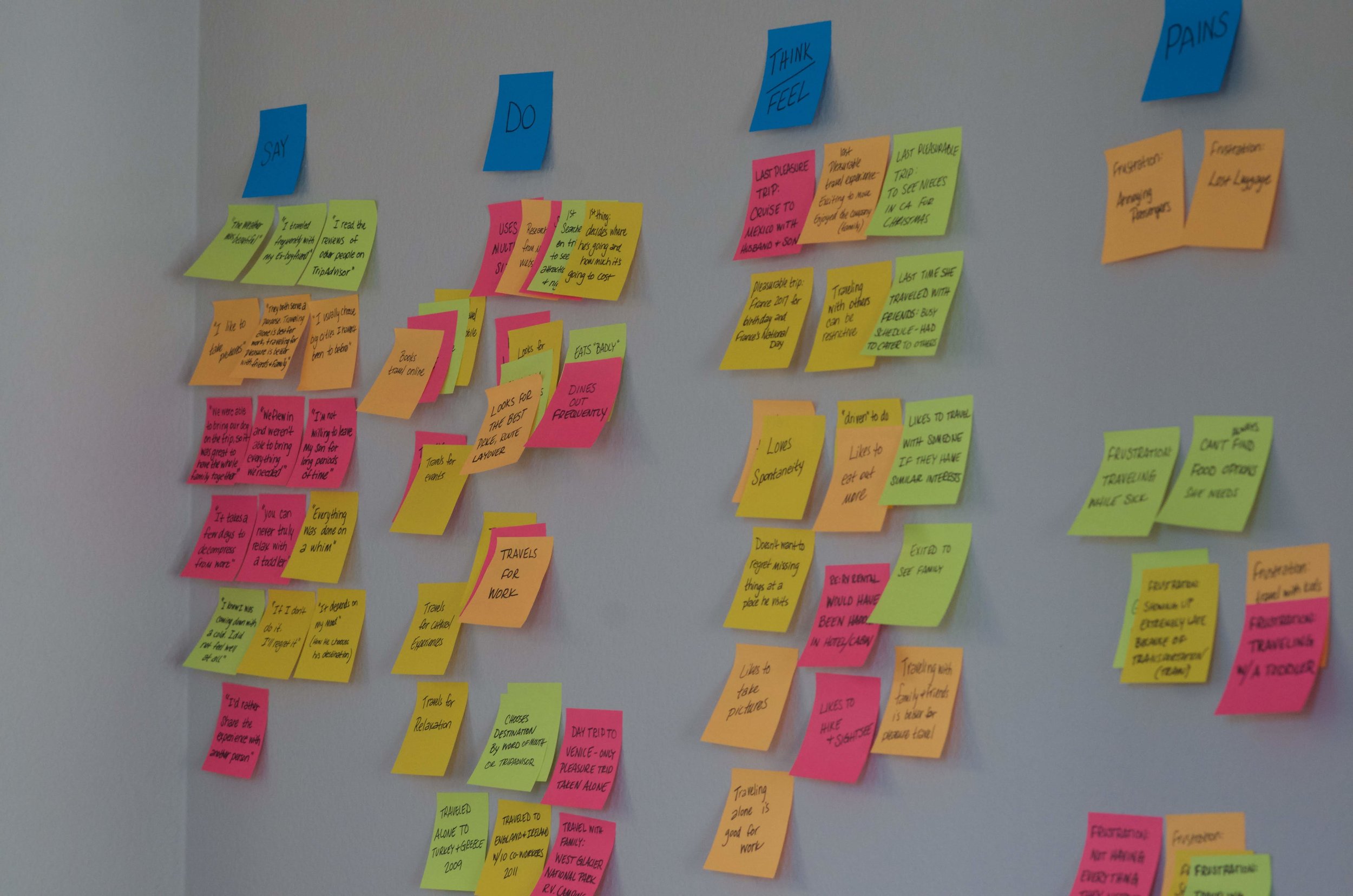
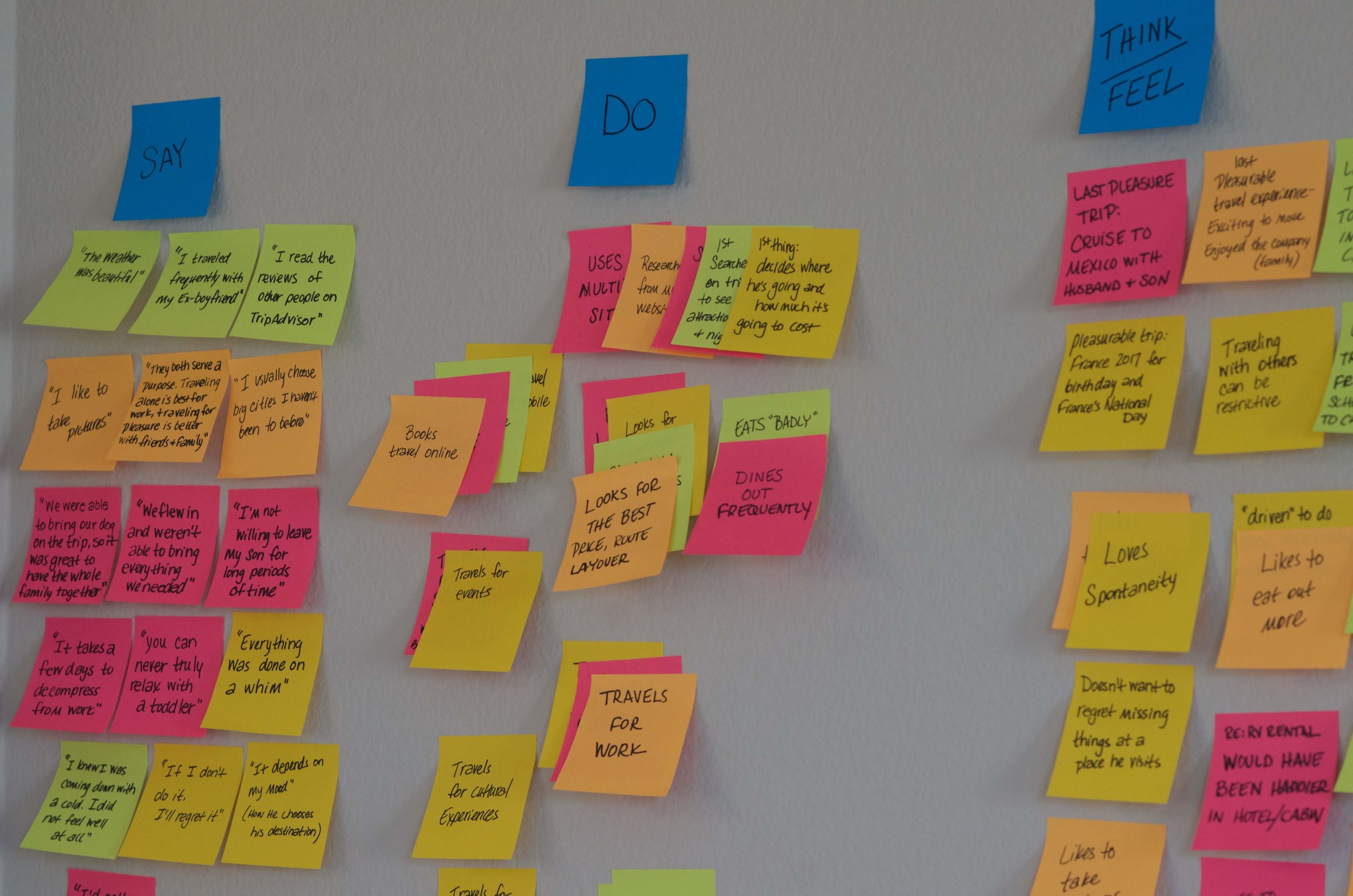
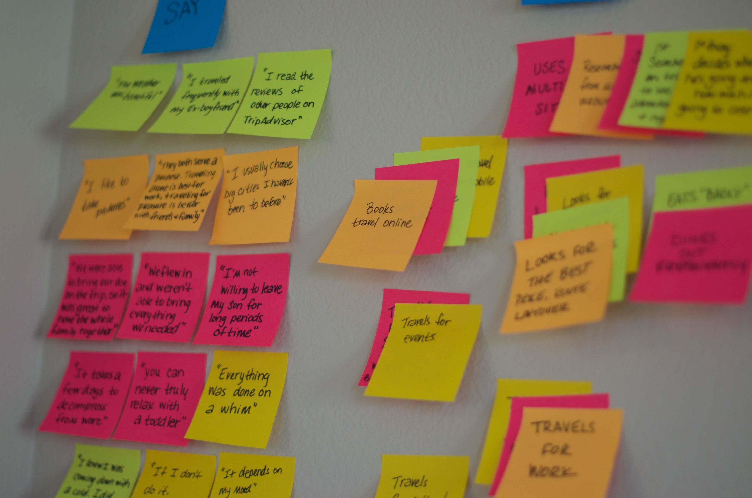
From the research I discovered an overwhelming majority of users are searching for and booking their travel arrangements on multiple devices. Responsiveness of the site will be crucial. Users also consider cost above all other factors, so allowing them to compare prices will be important as well. Travellers like to have control over their plans both before they book and while they are in destination, but they also desire the flexibility to make changes.
For a more detailed look at my research findings, click here.
Define the problem
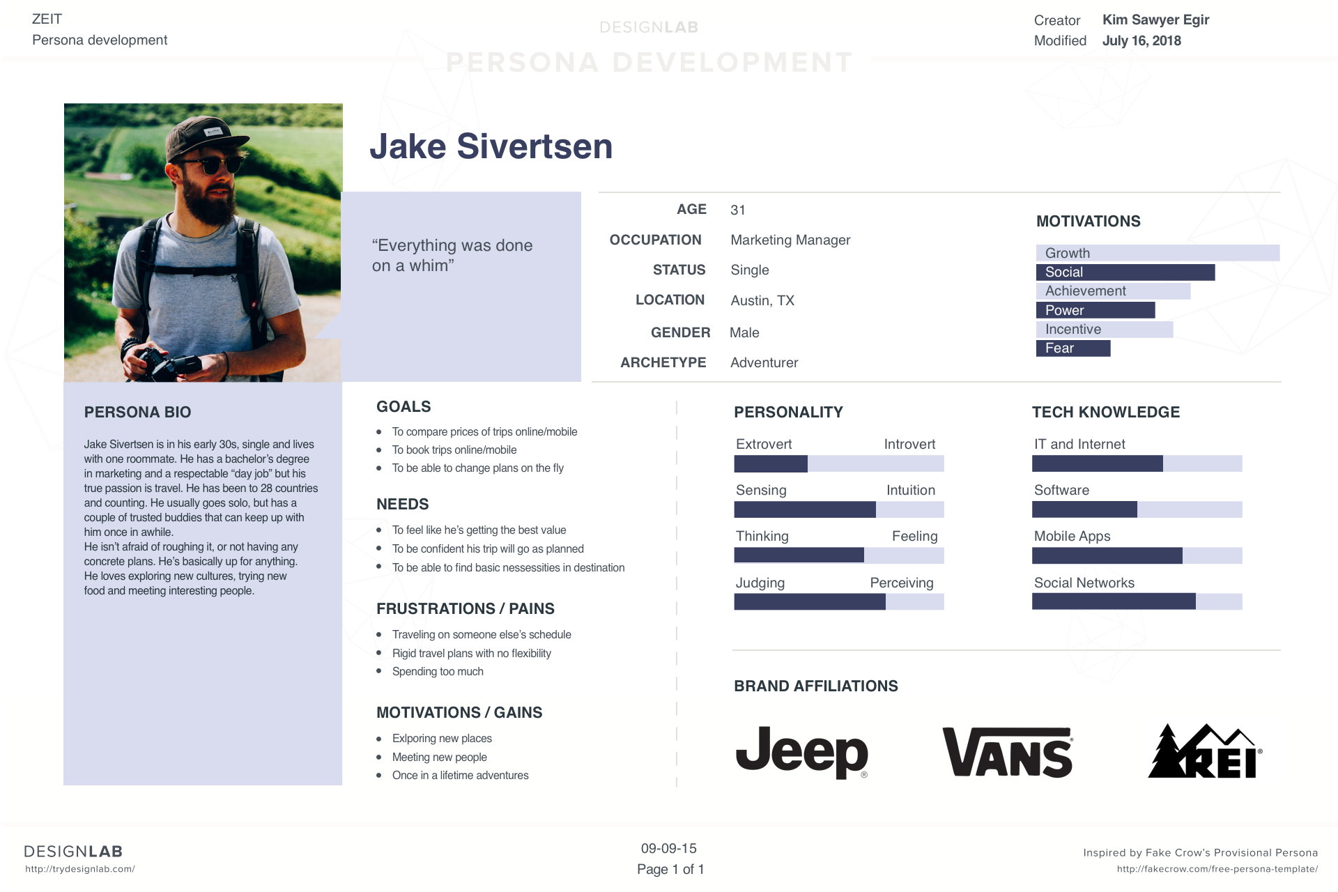
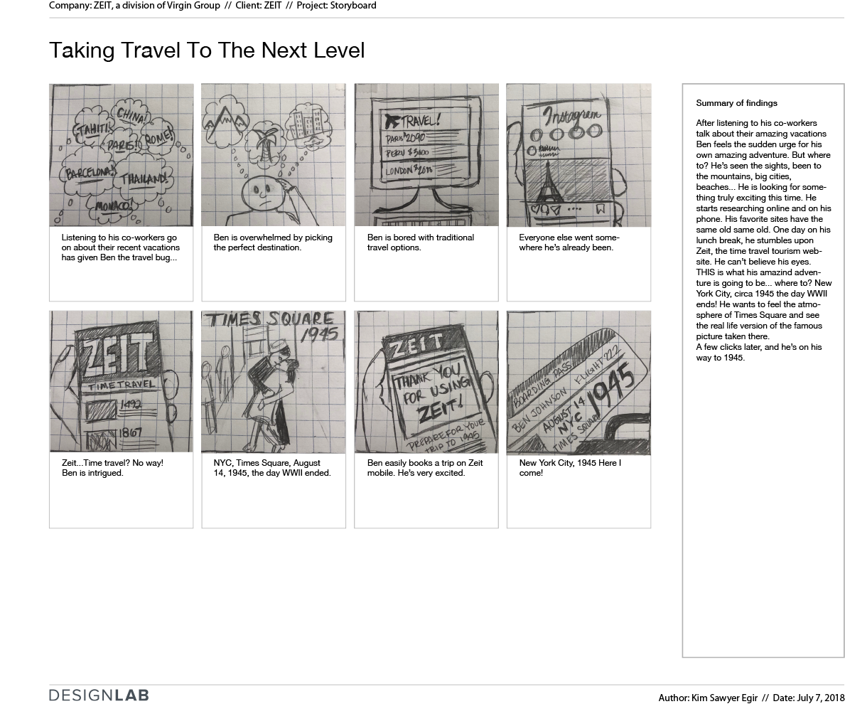
I used several tools to analyze my research findings. First I created an empathy map using the responses from my user interviews. By grouping the recurring themes I discovered some insights about user pains and gains. Uncovering the pains is a good starting point to define the problem(s). After that, I created a persona based on the secondary research findings, and the insights of the empathy map. I also created a storyboard to show the context of how the user might interact with the product.
HOW MIGHT WE?
With the users’ motivations, goals, needs and pain points identified, it’s time to translate them into actionable items. I created some “How Might We” questions to illustrate the problems and to spark brainstorming of possible solutions.
• How might we categorize and present the travel packages in a way that makes sense to the user?
• How might we enable users to sort trips by cost or other factors that allow them to make the best decision based on their needs?
• How might we present enough information to help users feel like they have full control of their travel arrangements?
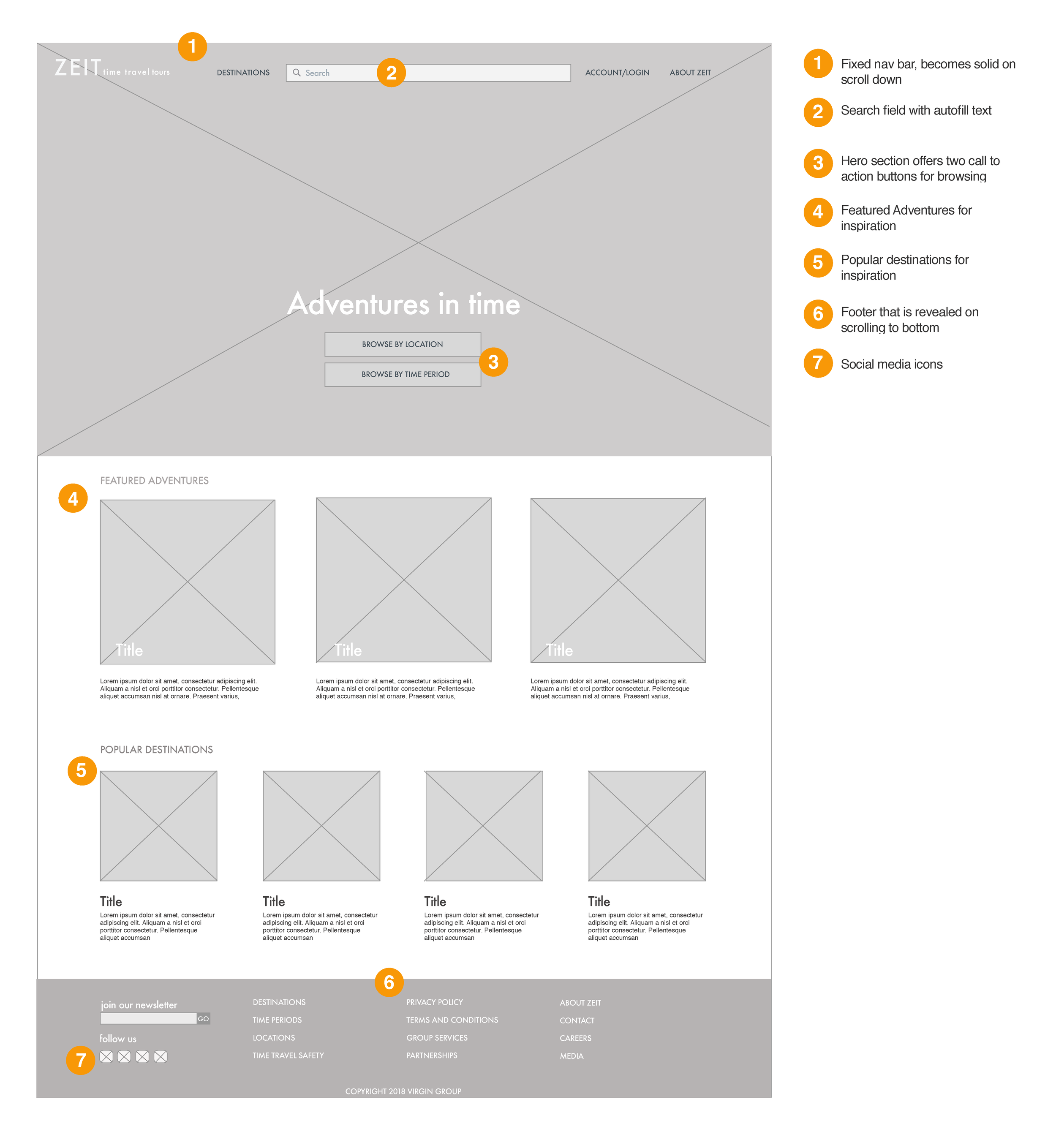
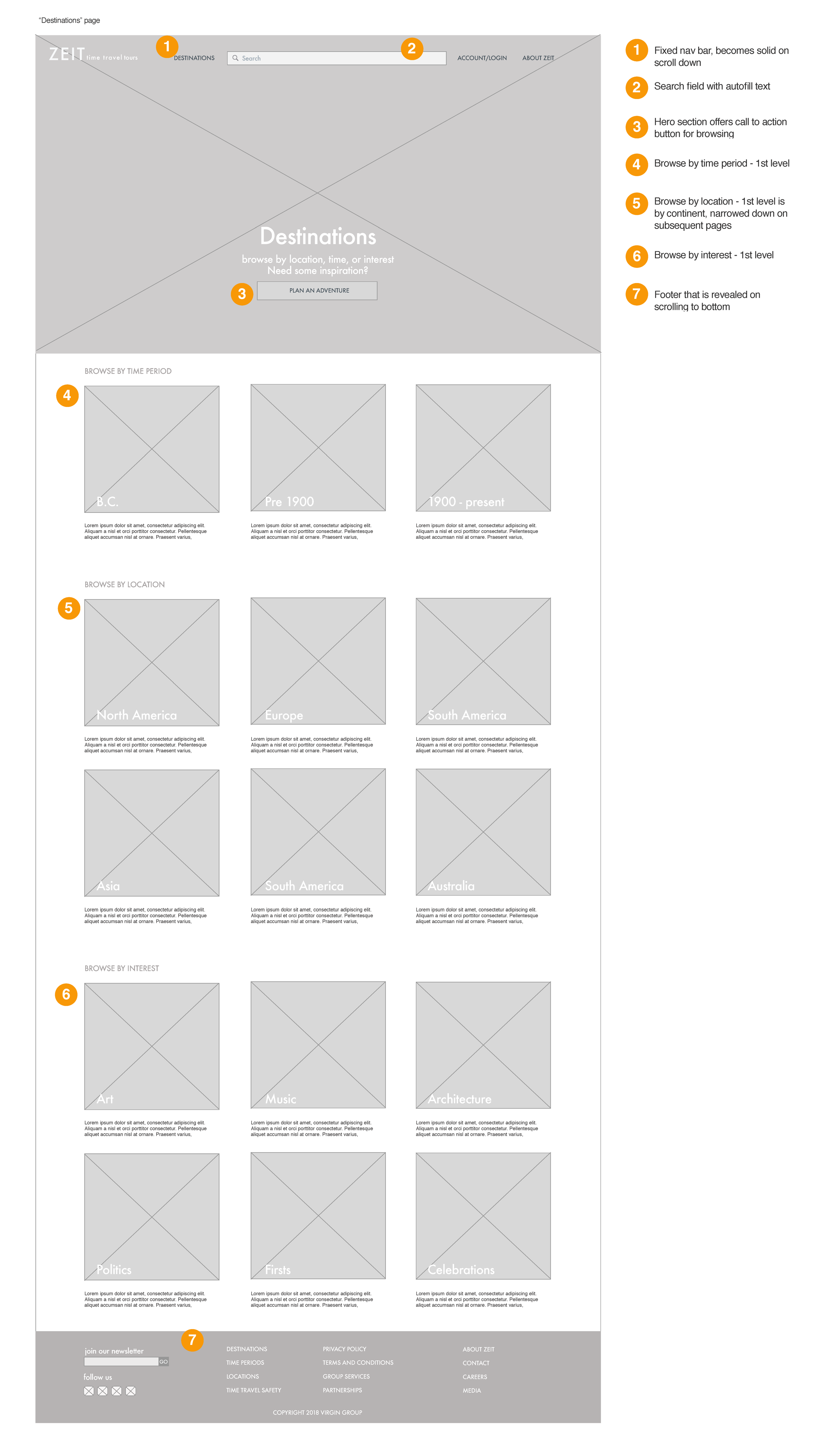
Information architecture
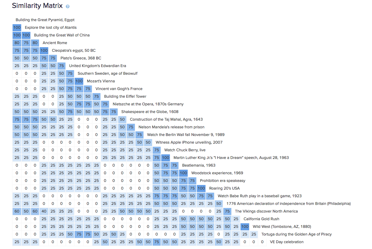
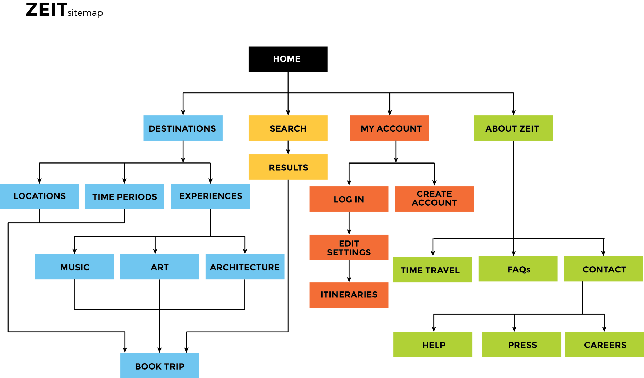
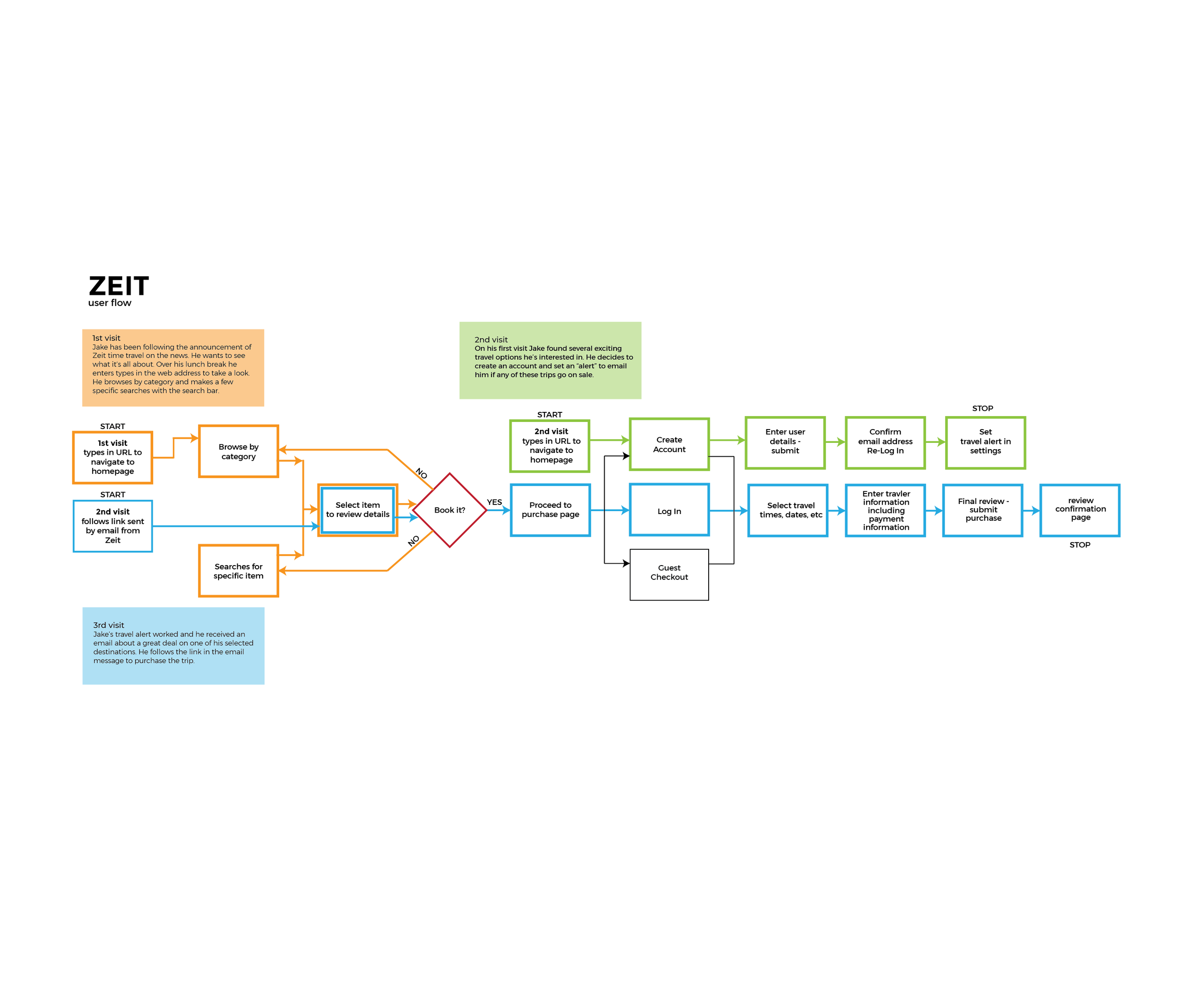
This is where adding the element of time posed a challenge to the design pattern and site structure of existing “typical” travel sites - what our users are accustomed to using. To try to determine logical organization of the information I conducted a cart sorting exercise with 11 users. This allowed me to see how users would categorize the trips. Users sorted the trips into three categories, location, time period and by interest. I used the information from the card sort to create a sitemap and User flow diagrams help illustrate exactly how a user might search for and book trips using these three categories.
ideate
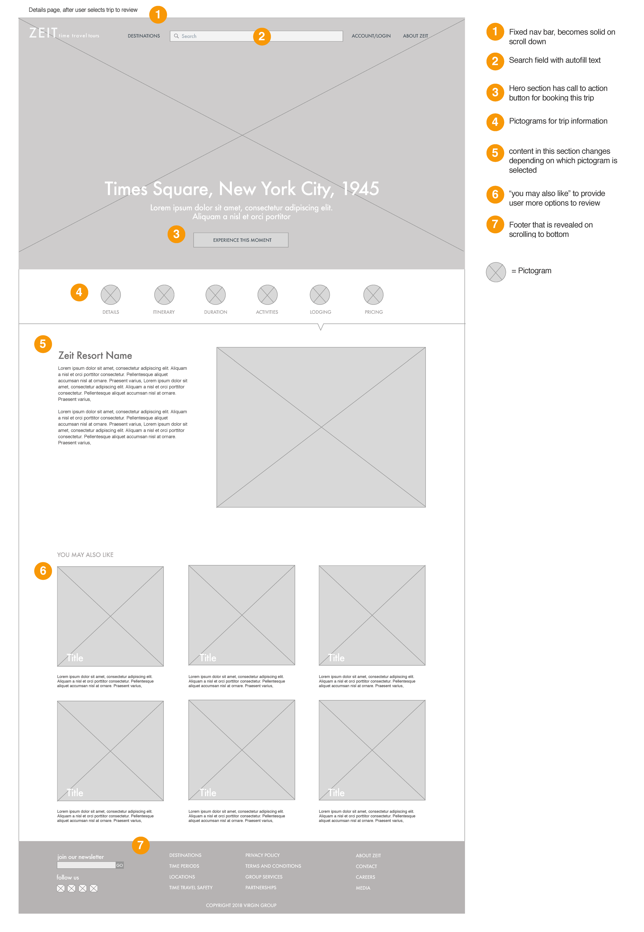
With the problems defined, it’s time to start finding solutions. I will start trying to explore all possible solutions to the design challenges of the site. With my site map and user flows as guides, I will start by making sketches of possible layouts and varying content for the site. The sketches and flows help me decide which solution to pursue. I will take that proposed solution and create wireframes. I’ll start with low fidelity wireframes that allow for rapid prototyping. Eventually I will create high fidelity wireframes that give a glimpse of what the final site will look like including the UI elements.
Sketching a few different versions of the site before wireframing
UI DESIGN
The Zeit brand must be created from scratch. Though it is a subsidiary of Virgin it must have it’s own identity. I wanted the site to feel like the natural history museum come to life, but with a retro vibe. The site also needed to feel modern, due to the high tech nature of time travel. I used a retro color palette that is also fresh and modern with pops of color. I chose orange for CTAs and a green patina like color for additional accents

prototype
I created a low fidelity prototype of the user task flow of searching for and booking a trip. I kept the prototype low fidelity to be able to quickly iterate after initial user testing. After user testing with the prototype, I created some low to mid fidelity screens to show a little more of the user interface design. Click to view
TEST
After I created the InVision task prototype for Zeit I conducted usability testing with three users. Although the completion rate was 100% and there were no critical errors, I decided to make significant changes to the browse function of the home page and add filters. In user testing I felt that there were too many clicks for users to get to where they were trying to go, and filters would help alleviate this or eliminate it altogether.
Next steps
For the next iteration I would recommend implementing the high priority revisions I discovered in my user testing. These changes are significant and will require iteration on wireframes, prototype and further user testing.
