UX/UI DESIGN
Designing a Regional Water Authority Website for Specialized Users
Role: Senior UX Designer
Product: Public-facing website, data visualizations, internal database
Context: Government agency, regulatory compliance, specialized user groups
OVERVIEW
Supporting Water Management Through Clear Information Access
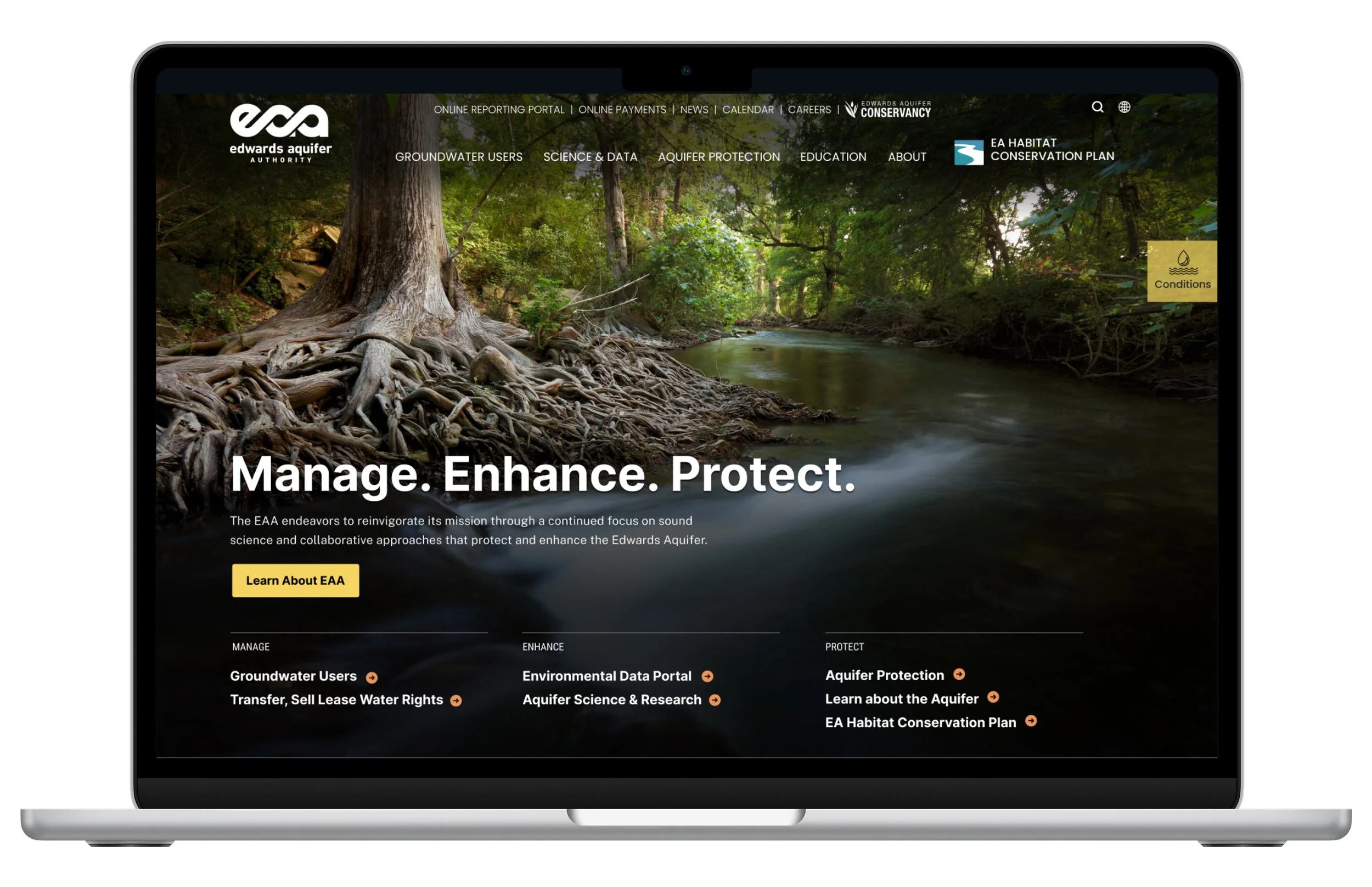
The Edwards Aquifer Authority (EAA) is a regional water management agency that regulates aquifer use in central Texas. The agency needed to redesign its public website and create an internal database dashboard. The project focused on integrating two external sites (conservation and education) into the main platform, organizing complex scientific content, and making technical water management information accessible to permit holders, educators, and the general public.
THE CHALLENGE
Navigating Competing Visions While Serving Specialized Users
EAA's website served multiple distinct audiences—permit holders, educators, conservation advocates, scientific researchers, and the general public—each with different information needs. Key constraints included:
Integrating two standalone external sites (conservation and education) into the main website architecture
Making complex scientific and regulatory content accessible to general audiences
Balancing stakeholder preferences for visual design with the practical needs of permit holders who relied on the site for time-sensitive water management information
Designing a flexible CMS that non-technical staff could maintain independently
MY ROLE & SCOPE
Information Architecture and Template Design
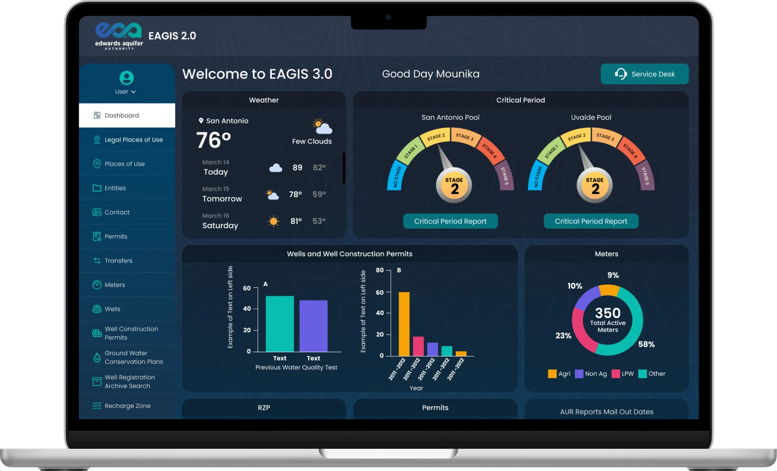
I worked as the senior UX designer in collaboration with a project manager, content strategists, and developers. I conducted 8 stakeholder interviews with department heads, then created the information architecture, wireframes, page designs, and design specifications for development. In addition to the public website, I designed the visual interface for an internal user database dashboard based on client-provided metrics and requirements.
EAGIS Internal dashboard providing staff with real-time aquifer conditions and operational data
KEY UX DECISIONS
Design Decisions Focused on Function, Flexibility, and Long-Term Maintenance
Navigation
Integrating Multiple Sites Into a Unified System
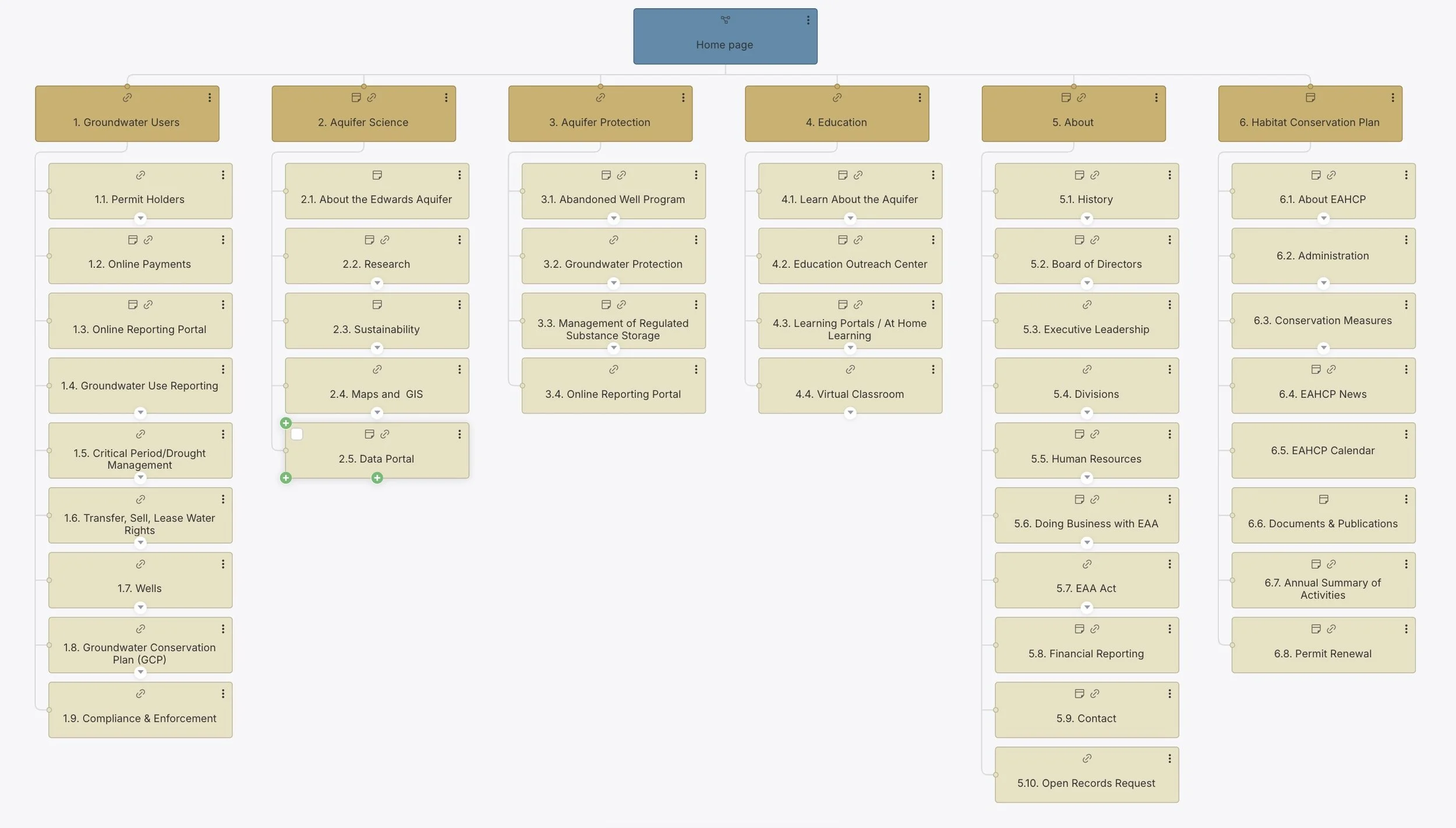
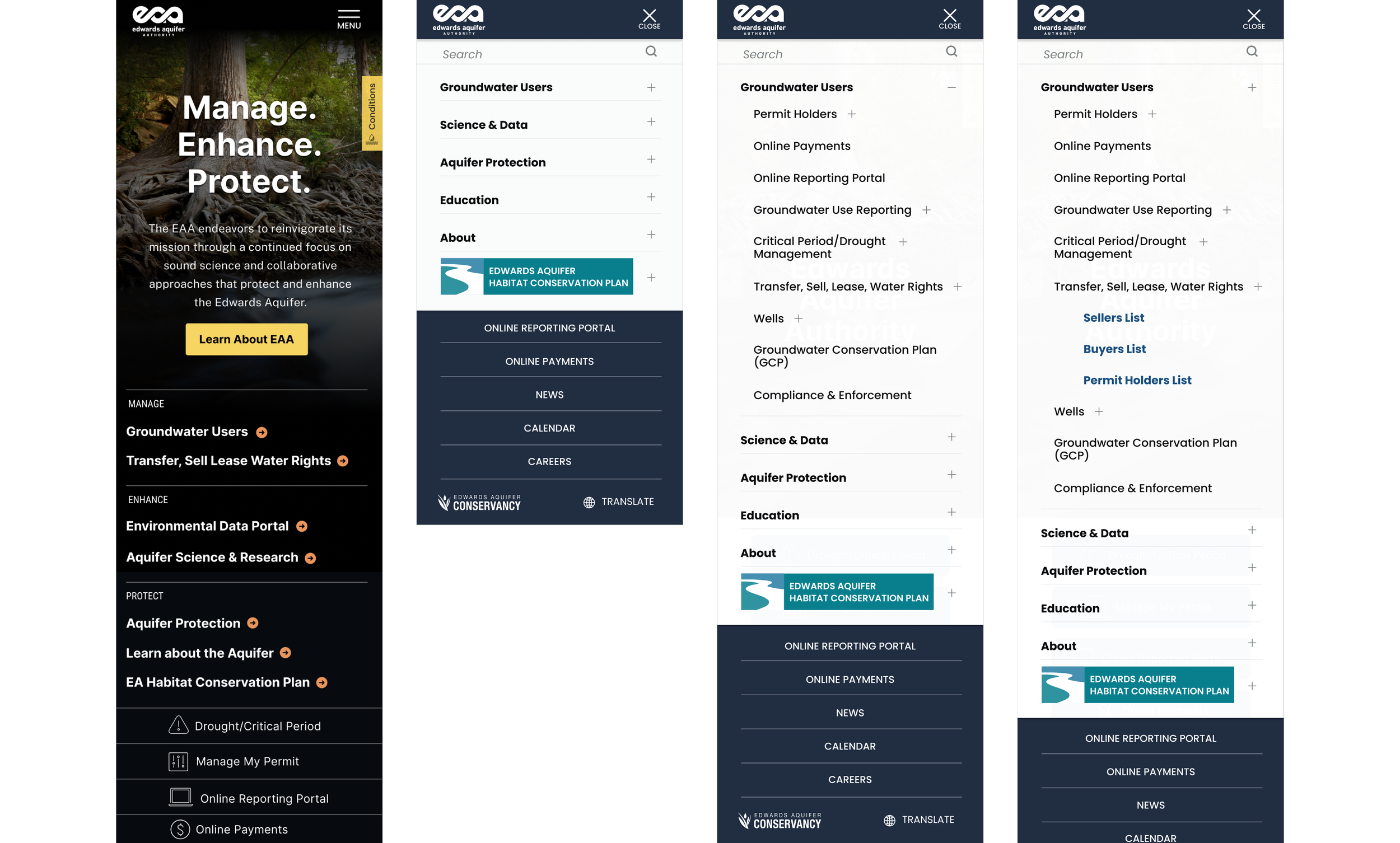
EAA maintained a main website plus two separate external sites for conservation programs and education initiatives. I restructured the navigation to bring all three properties under a unified system, giving conservation and education their own dropdown sections in the main navigation. This allowed each area to maintain its distinct focus while making all EAA content accessible from a single entry point.
Information architecture for new EAA site incorporating previously external sites for Conservation and Education into one unified navigation
Mobile navigation showing Conservation and Education as integrated. Conservation retains separate “button” to set is apart.
Templates & Page Builder System
Building a Flexible System for Ongoing Content Management
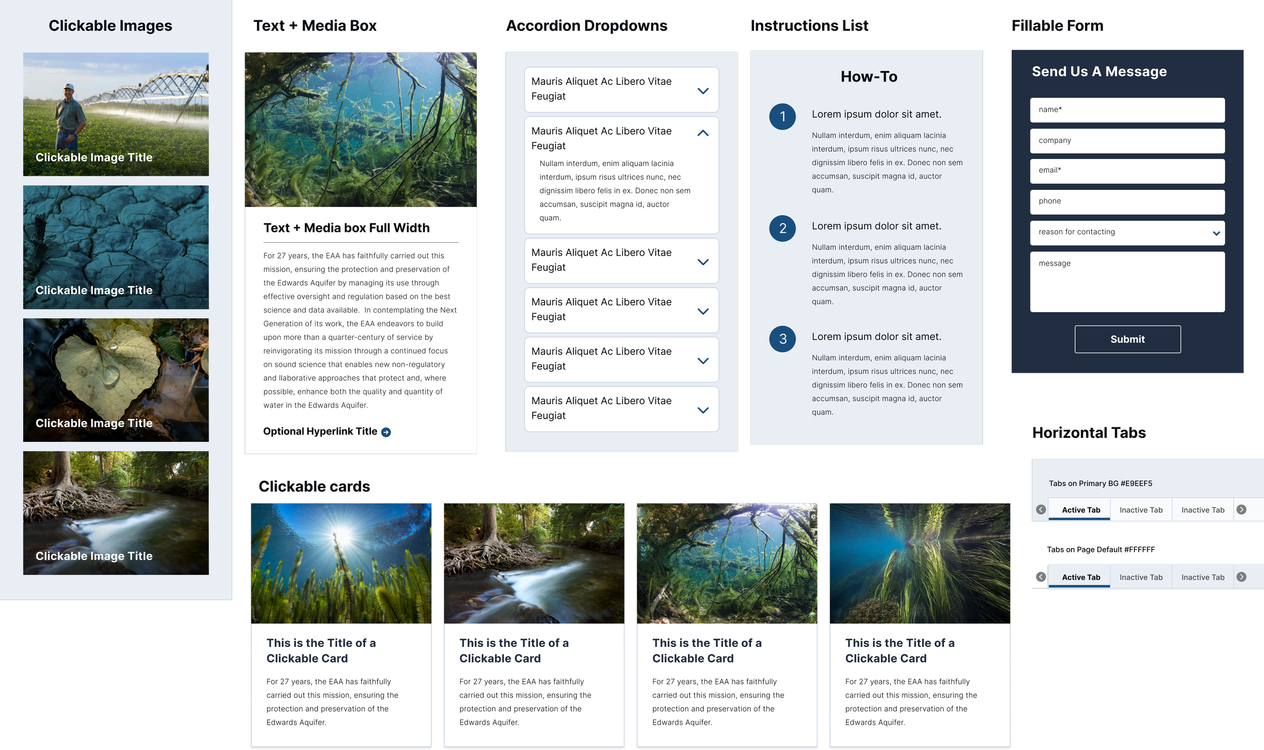
I designed 17 custom page templates to address EAA's specific content needs, ranging from news and events to specialized document directories, learning modules, and calculator pages for permit holders. Alongside these templates, I styled our standard library of page builder blocks—including accordions, cards, tables, and media components—to work consistently across the site. This modular approach allowed non-technical staff to build new pages by mixing and matching components while maintaining visual consistency and proper information hierarchy.
Styled page builder blocks enabling editors to assemble pages without design support
Data Visualization
Visualizing Drought Conditions for Quick Decisions
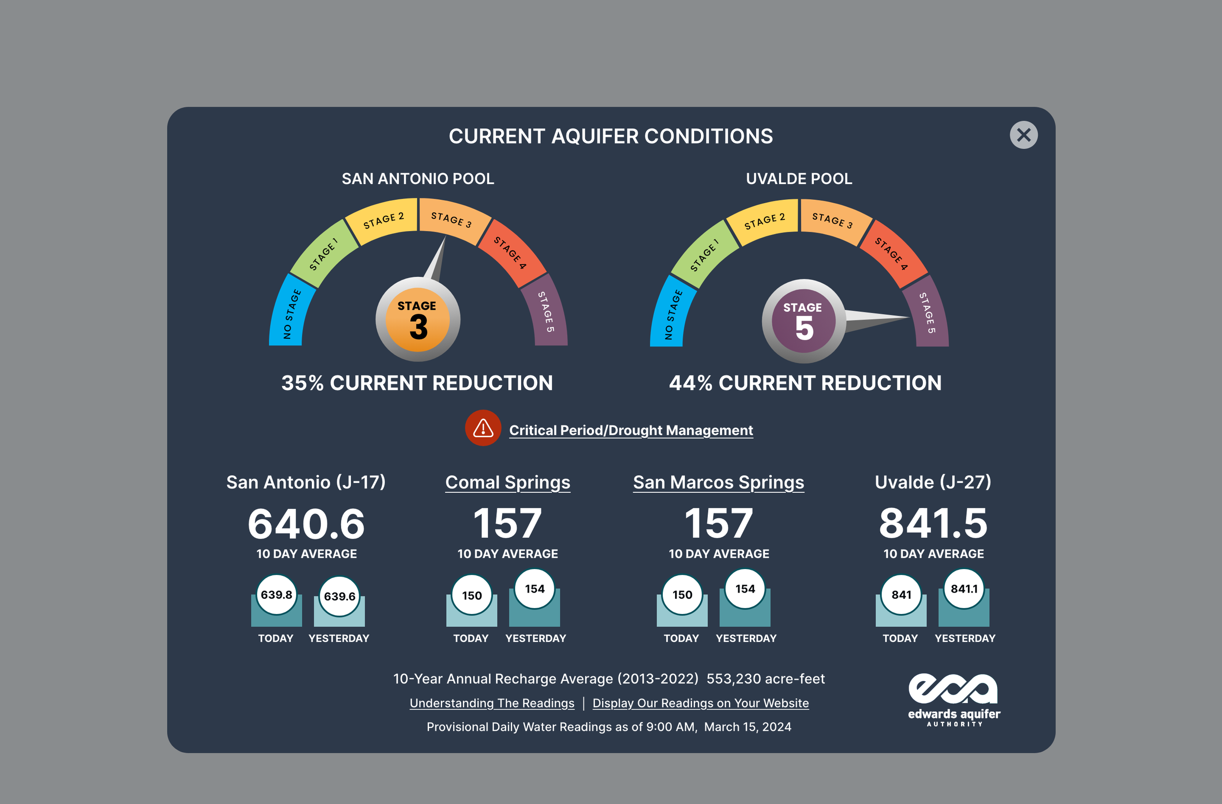
Permit holders checking drought conditions need immediate answers—whether they can irrigate depends on real-time aquifer levels. I designed a drought conditions gauge modal using color-coded visual indicators that translated complex scientific measurements into at-a-glance status updates. This allowed water users to make time-sensitive operational decisions without parsing technical data tables.
Drought conditions modal overlay on Home page provides at-a-glance drought status through color-coded visual indicators. Accessible via the “conditions” sticky tab.
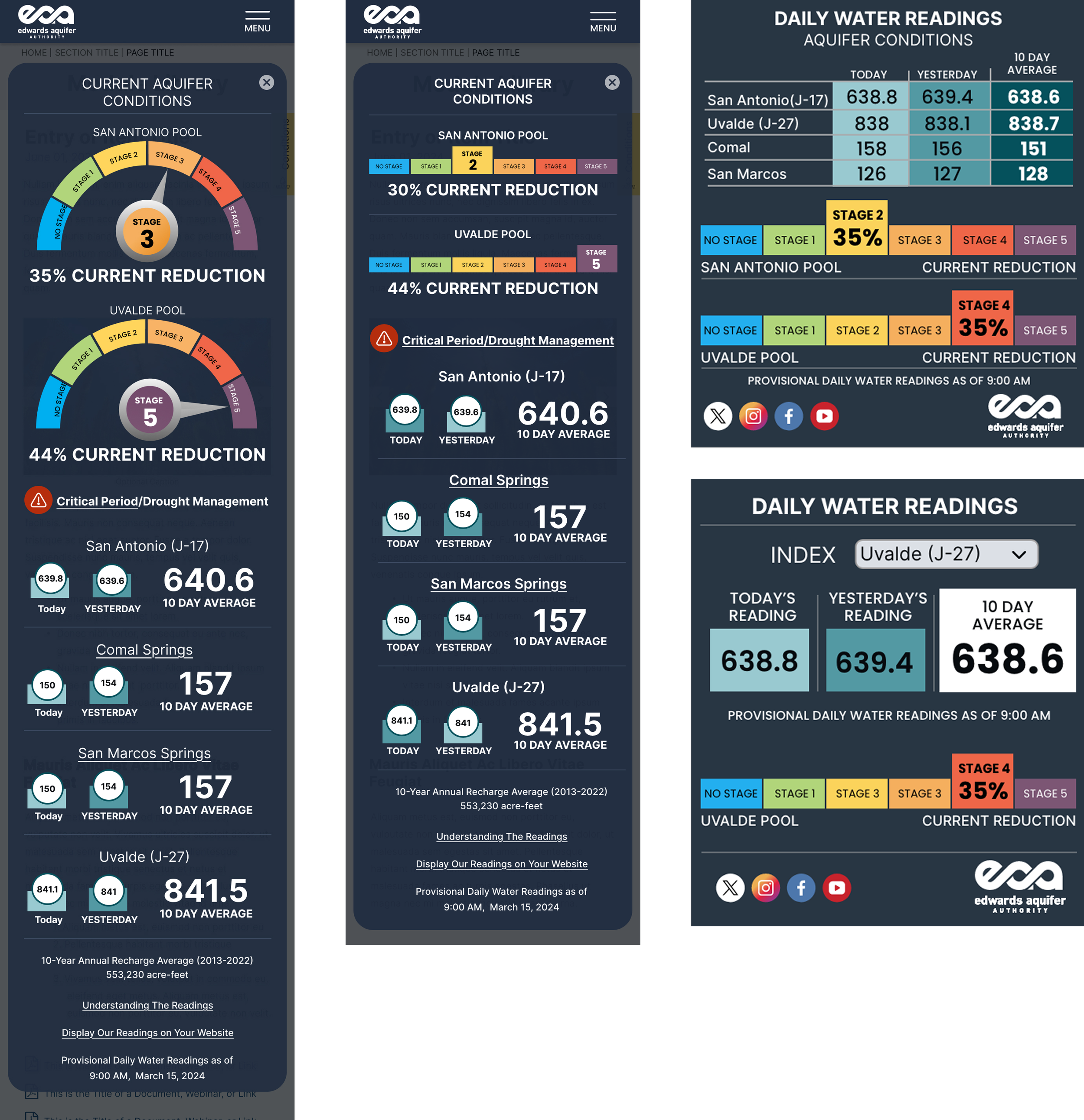
MOBILE Drought conditions modal overlay on Home page provides at-a-glance drought status through color-coded visual indicators.
Daily water reading widgets available via iframe for distribution to partner sites
Visual Design Approach
Advocating for User Needs Over Aesthetic Preferences
Throughout the project, stakeholder visions for the site pulled in different directions—some wanted a tech-forward, modern aesthetic, while others pushed for an editorial-style design with prominent photography. Both visions focused on aesthetics over the practical needs of users who relied on the site daily.
I focused on designing for the site's primary users—permit holders and groundwater users who needed quick access to tools and information. The drought gauges, for example, translated technical data into immediately useful visuals. Template designs prioritized clear layouts and easy navigation. I incorporated large photography and modern design elements where they didn't interfere with usability, but the core structure was built around how people actually used the site—checking drought conditions, accessing permits, and using calculators.
OUTCOMES
Delivering a Maintainable System for Ongoing Use
The redesigned website launched in April 2025. I worked directly with developers during handoff, providing detailed specifications and explaining design decisions. The final deliverable was a WordPress-based system that EAA staff could maintain independently, with templates and page builder blocks that guide editors toward accessible, on-brand outcomes without requiring external support.
REFLECTION
Navigating User Needs and Organizational Realities
The final homepage design was changed shortly before launch based on stakeholder direction. This project reinforced that strong UX recommendations don't always win out against organizational dynamics, and that my role is to advocate for users while recognizing clients make final decisions. I’ll continue to prioritize how users actually interact with information over aesthetic preferences, while finding ways to incorporate visual interest that enhances rather than obscures function.

